


Dolls
2010
credit: Mosnter High wiki (upload)
Originally provided by Mattel, circa 2010
After months of building up hype (if you were there when the ads launched, at least), the Monster High dolls were finally released in 2010. They had a soft-launch as Justice exclusives before being rolled out in other stores. The first Monster High doll I got was a Frankie doll from Kmart, which is a little sad since they're almost all closed. I think that, ironically, our local Kmart closed around the time that G2 of Monster High ended. Sad and almost poetic.
Ghoulia would be released much later than the other ghouls, being made available in late fall shortly before Christmas. When all the other dolls had their pics uploaded online and Ghoulia wasn't listed, I freaked out because I thought they just weren't going to make a doll of her. Luckily, they did although I never got my hands on her :'(
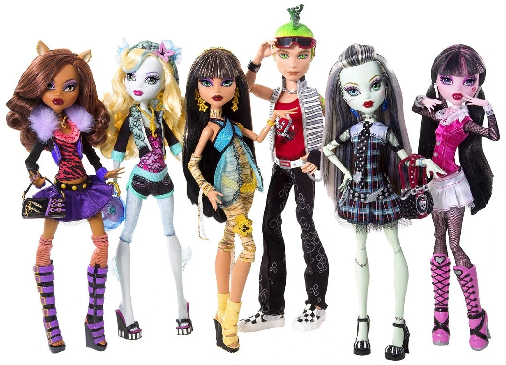
In total, there were three lines released in 2010: the basic line (which I am including SDCC Frankie as an extension of), Dawn of the Dance, and Gloom Beach. There were also two playsets and one fashion pack released.
BASIC LINE
This line may be basic, but the dolls are anything but!
I never knew that fashion dolls could be that high quality. My brain would have melted if I'd seen a Rainbow High doll (implied time travelling aside lol). I don't think that brands realize that kids see this type of quality. And little kids (5 and under) by and large don't - I had a series of knock off Disney Princess dolls as a kid that I thought were the real thing and were just like Barbies (they were actually based on Sindy, including having a peg head that popped off instead of the standard anchors). But as kids get older, they start to pick up on these things more. And by making high quality dolls, you're more likely to hook tweens AND lure in older collectors, too. And Monster High has never been meant for that young of a demographic or else the hands wouldn't be choking hazards. Mattel's website said they were for ages 6-8, but I always thought the marketing was targeted more towards 8-10, with the 6-7 crowd being more of a consequence of kids wanting to copy older kids. Y'know, just getting on the internet and developing an interest in fashion and being able to relate better to the basics of drama. Maybe that's just me, but I was 11 at the time and DEFINITELY felt like the marketing was aimed at me, albiet that I was on the older end of things.
Each doll in this line was packaged with a bag (or similar accessory), pet, diary, stand, and brush.
FRANKIE STEIN
"Stitched together with style!"
As I already said, Frankie was my first Monster High doll and, of all the ghouls, I have the most of her.
I truly adore Frankie's design. I love that she has black and white hair to reference the Bride of Frankenstein. I love that her shoes carry this motif. I love that her hairstyle makes her head look a little more square and taller, like her dad's,. I don't think it was intentional, since this isn't unique to Frankie, but I love how her shoes have a slight platform to them. I love the use of studs on her belt and purse and buttons on her shoes to compliment her bolts. I love how the chains used on the belt and her earrings look visually similar to stitches. I love the visible stitches on her top. I love that she's dressed in plaid because it has lots of crisscrossing patterns which also look kind of like her stitches (the use of mesh on her sleeves and underskirt also do this). I love how her outfit is preppy to represent that her parents had to be nerdy scientists to make her. I love that she's in a whole bunch of mismatched patterns that she somehow makes work (I think it's because of the motifs in her accessories balancing things out and tying everything together). I love how the polkadots on her tie echo her belt's studs. I love that said studs resemble bolts. I love the lightning bolt on her belt. I love that her bracelet sort of resembles a metal cuff, like the ones used on the tablesg Frankenstein's monster and his bride were brought to life on. I think I might be seeing things with this one, but I love that something about her white, sleeveless shirt reminds me of her mother's dress. I love that she has heterochromia. I love how her red lipstick pops against her green skin without clashing thanks to the way both colors are desaturated and instead brings out the other uses of the color in her dress and purse. I love how all these little details came together to create a coherent and beautiful design.
I also like how the webisodes reinterpret her striped hair to have a lightning bolt design instead of leaving her poor belt as the only lightning motif. Although I will complain that her added widow's peak takes away from how square her head looks! Unfortunately, the lightning design would be near impossible to translate to a doll. She is still near perfect, though. Just a wonderful design all around.
The idea to give her a pet who is a mishmash of different animals is also such a fun idea. And truly, I can't see Frankie with any other sort of pet. I love that Watzit's patches are literally patches with a different fur color. And isn't it so sweet that his eyes match his owner's?
For Frankie's doll, a few things differ from her artwork. Namely, her eyebrows are brown instead of the same dark gray used in her art. I really don't like this decision. I think that it was probably to soften her features up a little bit, but I don't think the gray was dark enough to make her look intimidating or anything. They also made her design lose a little cohesion in the shades of blue used. See, in the artwork, her blue eye, earrings, and the middle of her bracelet are all the same shade of electric blue. In her actual doll, her eyes and bracelet are almost the same shade, but her earrings are a radically different royal blue. Her nails also aren't painted, but this isn't much of an issue since her hands are so tiny. Additionally, I just noticed that part of the reason her artwork looks so much more youthful than her doll is because the design is a bit plumper. Yeah, she's still very skinny, but not as skinny as her doll who looks almost skeletal. Even though I think the choice to make these dolls so skinny wasn't without merit since it made them look similar to Tim Burton characters (although I am excited that they're going to start including more body types in Gen 3), I do kind of wish they'd have put a little more plastic on their bones. Maybe this helped them stay more cost effective, though, while still being stylish and detailed and some of the highest quality dolls on the market during their heyday. And in that case, I'll hold my tongue.
We also have concept art AND a concept doll for Frankie's design. Based on the 2010 copyright on the artwork, I think the doll precedes the artwork. Some interesting things to note here are that Frankie was originally going to have less of a green skin tone. While Frankenstein's monster is widely remembered in pop culture as having green skin ranging in tone from mint green to a vibrant emerald, this tone is actually much closer to the skin tone the Boris Karloff incarnation was going to bear in Son of Frankenstein before the studio decided to produce the film in black and white. It's also closer to the novel version of the monster, who is described as having yellowish skin. The plaid pattern of her dress was also going to be a bit more drab at some point in development, as we can see with the concept art. She also had a ruffle on her blouse, polkadots in her sleeves' mesh, a skull and crossbones motif instead of the skullettes, and different bracelets (plural). I think I might have just unlocked having attention to detail.
So lets break down how changing these things tightened up Frankie's design. I am, by no means, a fashion expert. But I do have two eyes that sort of work. And I can tell you that a lot of these changes were for the better.
I think that Frankie's pastel, minty skin tone is a good mixture of pop culture, emerald green Frankenstein and the actual film's much-less-saturated-but-unfortunately-very-yellow version. The other version made her look a little too corpse-y, but too vibrant of a color would have made styling her outfits too hard. This color is a great compromise that feel more inviting while also feeling fashionable. Making her skin less yellow also prevented the red from feeling like it was clashing as much as popping.
Even though with the yellower design, Frankie's dress ran the risk of being a bit tacky from creating some disharmony in the color scheme, changing her skin tone did enough to make the plaid from her prototype doll's dress mesh with her new color scheme. The brighter dress looks a lot more friendly and inviting with its brighter colors, while the drab dress isn't as eye-catching. There are surely some color theory reasons at play, but there's so much conflicting and inaccurate information online about color theory that, while researching, I saw a chart that said that yellow and magenta are complimentary colors. And that was when I decided going more in depth wasn't worth it.
While in theory, I like how the ruffle adds some gothic flair to the outfit, it makes the area look a little visually crowded with the tie. I really do see what they were going for, but it just wasn't going to work. Too much going on at once. Either the ruffle or the tie was going to have to go, and I think they made the right call on which one to keep.
The polkadots are mostly fine, although they still make the deign feel a little more unbalanced by comparison and don't create as much cohesion as the final design only having one type of mesh between the skirt and the sleeves.
The skullettes replacing the skull and crossbones were something that was only going to happen once the brand started to have an identity, but it's also one of my favorite changes. Again, the skull and crossbones design feels more cluttered in a design that already has a lot going on. The skullette is much simpler, more distinct, and adds to the overall branding of the franchise. It's such a little detail, but it really adds a lot to the design.
The bracelets are a little harder for me to analyze since I only can see them clearly in the artwork. It looks like of like the doll had a bracelet similar to Frankie's final bracelet, but it's hard to tell. Although the two bangles would have spoken to me as a kid and the charm bracelet adds another chain to go with Frankie's belt, the use of a random triangle feels out of place. I think it should have been another lightning bolt, maybe. While there's nothing wrong with these bracelets, I do think that the new bracelet's visual reference to the cuffs was a lot smarter of a design. That said, the charm bracelet did make me realize that the use of chains as a whole could be a reference to the monster being chained up in the original film or the scene in The Bride of Frankenstein when the monster escapes from being chained up. Naturally, there are chains on his arms, as well as all over his body to hold him in place. Chains are also featured pretty prominently in the films' sets in general. That said, the scene of Frankenstein being brought to life is a lot more recognizable in pop culture, so I think the cuff bracelet ultimately works out better.
After noticing all those little details, I think I've gained a new level of appreciation for Frankie's design. It's fun and cute but also very clever. I hope I can find even half the amount of details in the other designs as I did in hers.
Frankie's Diary
"Why would anyone want to read someone else's diary without asking first?"
| BACK | INDEX | NEXT |