Fright Song
The first time that I heard the full Monster High theme song as opposed to the bit used almost like a jingle at the start of each webisode was around mid-August, 2010. It was on Yahoo Kids. I'd recently discovered Yahoo Kids because the family laptop that I'd recently more or less appropriated had Yahoo as its homepage and so I happened to find out that they had games and videos and whatnot while browsing one day. One evening when I was on the website and saw that there was something Monster High related and, naturally, I was psyched! I listened to the song over and over again and could still recite the lyrics in my sleep. Albeit, if it was as a kid, I would have gotten more than a few lines wrong because my audio processing was not very good. Like, I thought it said "freaky she can fly" instead of "freaky, chic, and fly" because I wasn't used to hearing the word "chic" often. It was also probably the first time I heard the word "beguile" because they were really pulling out the vocal words in the lyrics.
If you're like me, you probably always assumed that the actors in the music video were the singers. They are not, though. The actual singer behind the song is Windy Wagner. No idea who the rapper is, though. (While he's portrayed by Taylor Belnavis in the video, I'm pretty sure he was just a dancer/actor like everyone else in the video.)
Whether you know it or not, you've almost definitely heard Windy's vocals before! Are you familiar with a little show called Hannah Montana? The background vocalist on "Best of Both Worlds" is her! She's featured pretty prominently in the chorus, so I'm sure most people have heard her. Additionally, she recorded the demo and the backup vocals for the theme songs for Sunny with a Chance and Good Luck Charlie. Her vocals aren't as prominent there, but you can hear them if you're listening carefully. But the clearest example of Windy recording music for children's TV (aside from the Fright Song) has got to be the song "Bling Bling" from Shake It Up.
Going back to the music video, it follows a girl who is new at Monster High as she goes from a lonely newbie to having a bunch of friends and kind of ruling the school. The main character is supposed to be similar to Frankie what with the whole New Ghoul at School thing, but she's a zombie. The YouTube video and description really wants you to think she's Draculaura for some reason, though. It's very odd. 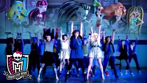 (Note: the older thumbnails for the video didn't compare the main character to Draculaura. It's actually gone through a few including this one with the main characters floating over a scene from the music video and, okay, I'm just going to come out and say this: it looks like one of those scenes in movies or shows where we see all the dead characters in the sky. It looks like we're supposed to be remembering that they're all still there in spirit) These definitely aren't live action versions of our ghouls, even if they have analogues, though. For one thing, there's too many of them. At launch, MH had six girl main characters and Deuce. The music video has around eight girls and two boys. And they're styled nothing like our main characters. Now, I'm not saying that they should have had the characters look exactly like the characters from the series or anything. I actually like that the music video manages to be its own thing while keeping true to the tone of the series. I think that's cool.
The video, fittingly, has the energy of a high school project if high school projects had decent budgets. That's not a dig. The best way to explain what I mean would be to show you the very end of the video 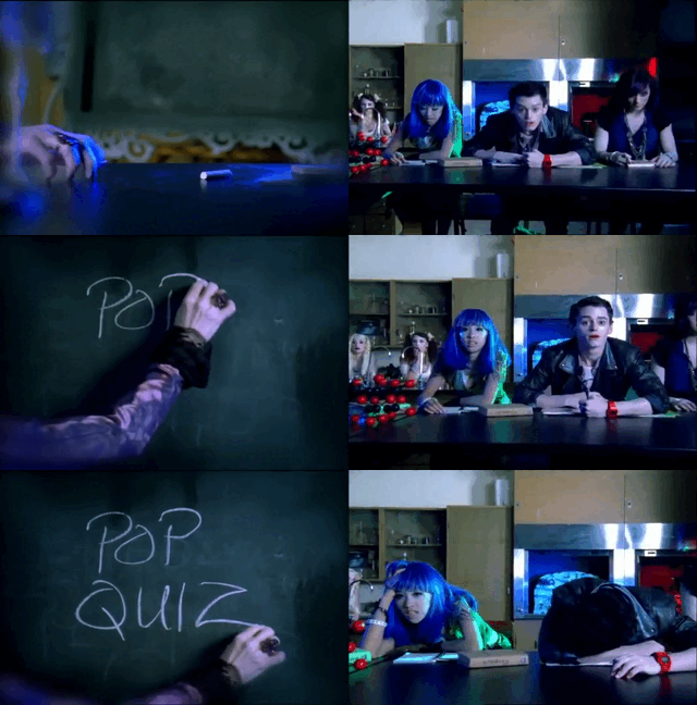 where the kids file in to their class and the music builds up as a disembodied hand writes something on the chalkboard... only for the words to be "pop quiz" and all the students to slouch in disappointment as an evil cackle that sounds remarkably like Maleficent plays us out. That's the type of humor a high schooler's school video project would have. Another scene with the same type of humor is when the main character sees a lunch tray with 2% milk and a hamburger and pushes it away like "ew get that out of my face!"
 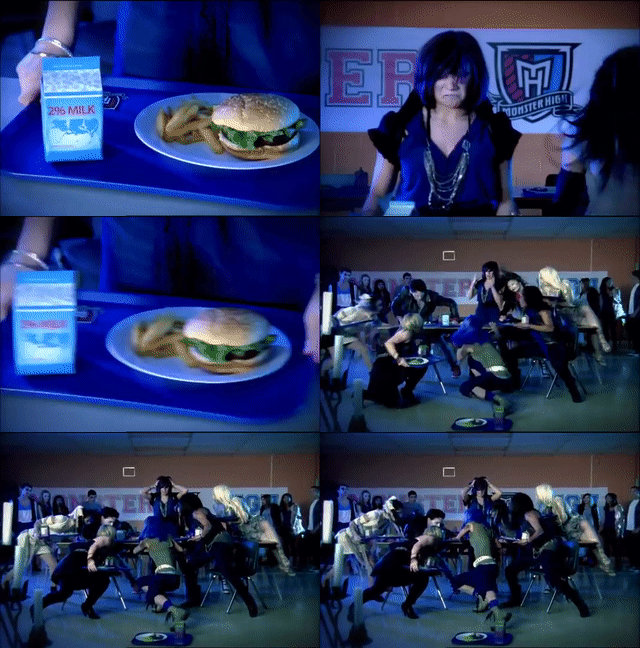 because they're monsters and they eat purple spaghetti and eyeballs and drink "Ghool Juice." Also, there's the student who is literally just a cheap Halloween skeleton with headphones around his neck. I love him. And the kid who is storing his head in his locker for some reason. Look, I've spent at least five minutes trying to figure out WHY he would do that and haven't come up with anything other than that he knows it's going to be an iconic bit. And you know what? Good for him.
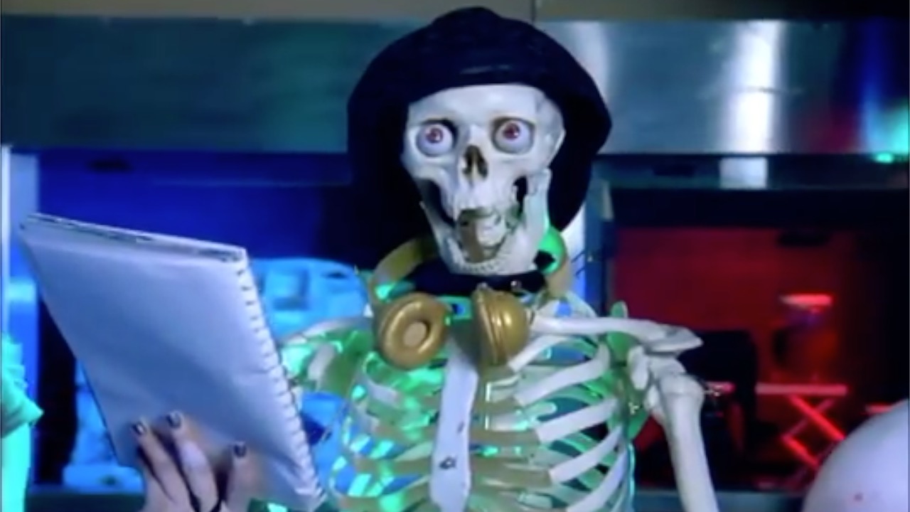
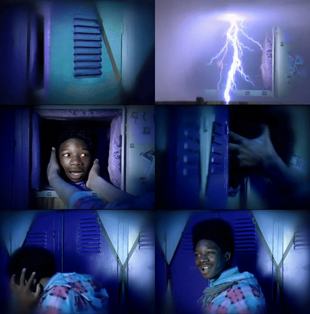
There they are. The best boys.
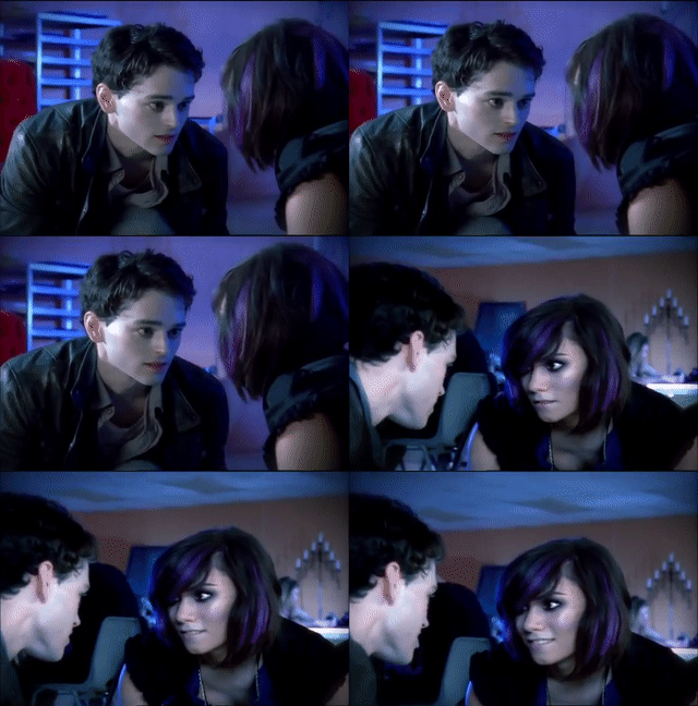
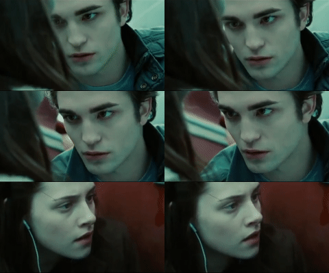
Cinematic parallels.
Another highlight that's going to sound sarcastic but isn't is that I'm obsessed with all the unnerving staring going on. As a contextual reminder, this music video was most likely filmed in late 2009 to early 2010, when Twilight was at its peak. This was an intentional choice. Heck, whenever the main character drops her juice carton and the "Hot Manster" comes to help her and the lock eyes, I legitimately had it in my head that was a scene from Twilight (it's not- I was conflating the part where Edward saves Bella from Tyler's out of control van with a moment where he kicks a falling apple into his hands). There's no way that he isn't supposed to low-key remind you of Edward, though, because if you look at the behind the scenes video, he's straight up covered in silvery glitter.
The music video was directed by Nigel Dick, who isn't a small name in the business. He directed music videos for the likes of Toto, Guns 'N Roses, Tears for Fears, Alice Cooper, Savage Garden, Matchbox Twenty, Madonna, Britany Spears, Mandy Moore, and more! Like, if you look through this man's filmography, he's inescapable. Especially as a 2000s kid whose dad kept the TV on 80s music videos at night, let me tell you. What I'm saying is that this video is most likely campy and silly and made to appeal to kids by design.
There was a lot of talent behind the video. Even the animated segments are oozing with effort. That's why the video, even if in retrospect as an adult it might feel silly, grabbed so many kids' attention. It deserves praise for what it accomplished.
There are a few other versions of the song in other languages. Notably, the Polish and Indian versions of the song would come with remakes of the music video. Each would include recreations of some of the most iconic scenes, including the headless boy and the dance-off with the cheerleaders. You can tell that these didn't have as big of budget and they REALLY feel like someone was trying to recreate the original music video for a homework assignment. Well, still with more production value than what a high schooler could realistically throw together, but with noticeably less than the original.
One problem they both have is that they lack the energy of the original. This isn't a problem with the dancers or anything. It's just because of differences in cinematographic choices. Both videos have extremely different color palettes from the original, which was full of high contrast and bright splashes of color against muted settings. The settings were dimly lit, but lit with hues of blue, purple, and green. This use of contrast just makes things feel more energetic. I don't know the how or the why, but it does. By comparison, the Polish version feels very washed out. It's also dimly lit, but the lighting doesn't seem so dynamic and is often just... white. It comes off feeling more like a poorly lit warehouse than a Halloween party. The Indian version is a step in the right direction, with its use of a multitude of colored lights. However, while the hues may contrast, there isn't a lot or variance in brightness and darkness. There's no pops of color on muted settings because it's too colorful. While the original isn't exactly highly saturated, the contrast against the dull colors made the other colors feel brighter. Again, though, the Indian version has the better lighting of the two as it feels more atmospheric.
But what really takes the energy out of the Indian video as compared to the original is the differences in the lengths and variance of the shots. See, the original Fright Song video is very kinetic. 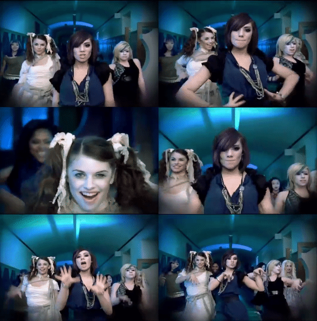 In the dance sequence especially, there are all kinds of cuts made to keep the energy up. Often, there are multiple shots per second, getting in multiple cuts during dance moves, yet still providing enough continuity that you'd be able to learn the dance sequence if you so chose. But you would need to focus. There are also camera tricks going on including what I'm pretty sure is a dolly zoom to artificially create more movement. In contrast, the Indian version's shots tend to be longer and to do much less interesting things with the camera work, mostly just bouncing back and forth from a full shot to a medium full shot of the lead. It just looks a little boring by comparison. The Polish version actually manages to typically have more cuts and the overall movement feels more energetic because of tricks like that, but the aforementioned issue with the lighting is very pervasive enough to make it less fun.
That said, there's nothing wrong with either of these music videos. Far from it! I can understand how they'd have their own appeal and know that a lot of hard work probably went into making all of the music videos. Never let someone's success take away from your own, you know? But I just wanted to explain why I think they look kind of off if you grew up on the original video like I did. I've got to put that semester of film class to use somehow! What I said also might be totally wrong or you, dear reader, might look at the music videos and think I'm way off base and that the Indian or Polish version is actually better. So I highly encourage you to watch them for yourself and come to your own conclusion! At the very least, it's fun to hear what English phrases got in to these versions.
There's also a Japanese version of the song which was used for the opening song of the anime. Trust me, we are totally going to get to the anime! Unfortunately, while I was able to find lyrics to a couple of these translations, I'm not multilingual, so I can't give context to any of the differences in translations, much as I'd love to. I did find a comment by a YouTube user named Tioko on (one of) the Russian version of the song (a very fun listen, by the way) that says that they call the school "School Number Zero" in the song because Russian schools are numbered, so a School Number Zero can't exist, which makes it spooky. Kind of like how that SyFy show based on Creepypastas was called Channel Zero. Same basic principal.
Actually, the translation of the Russian song seems really straight-forward, but nothing like the original. Instead, it has kind of a Haunted Mansion "foolish mortals" thing going on where it talks about how everyone who knows about the schools is unaccounted for, how only fear and pain are in store for the living, and how you will never return. Fun stuff!
The song would later be remade in 2016 in the form of "Gaga for Ghouls." More on that later, though.
If you'll notice, one thing I didn't really cover was the short animations of the characters dancing. That's because our next article is all about the animated commercial/short that tied into the music video: Higher Deaducation. See you there!
| BACK | INDEX | NEXT |
