


Website
2010
credit: the Monster High wiki
Originally from MonsterHigh.com, circa July 2010
If we wanna do this right, we've got to start at the beginning.
While, unfortunately, the Monster High website is no longer in existence and redirects you to a generic Mattel site, it wasn't always part of this homogenous, mobile friendly landscape we call late Web 2.0. No, this baby ran on Flash. I thought I would be able to see the website in its full glory via the Internet Archive because I downloaded an old browser and old version of Flash specifically because I wanted to play Neopets (or I could just use Ruffle). The trouble is a lot of the content was stored away in subfolders of subforders and the WayBack Machine only captured resources from the next year (with some resources only getting added some time after that and some only being crawled after they were long gone). So you can load the pages, but they'll be blank. For the sake of this article, we're just going to go by a combination of my memory, the wiki, and any documentation of the site accidentally made by children back in the day.
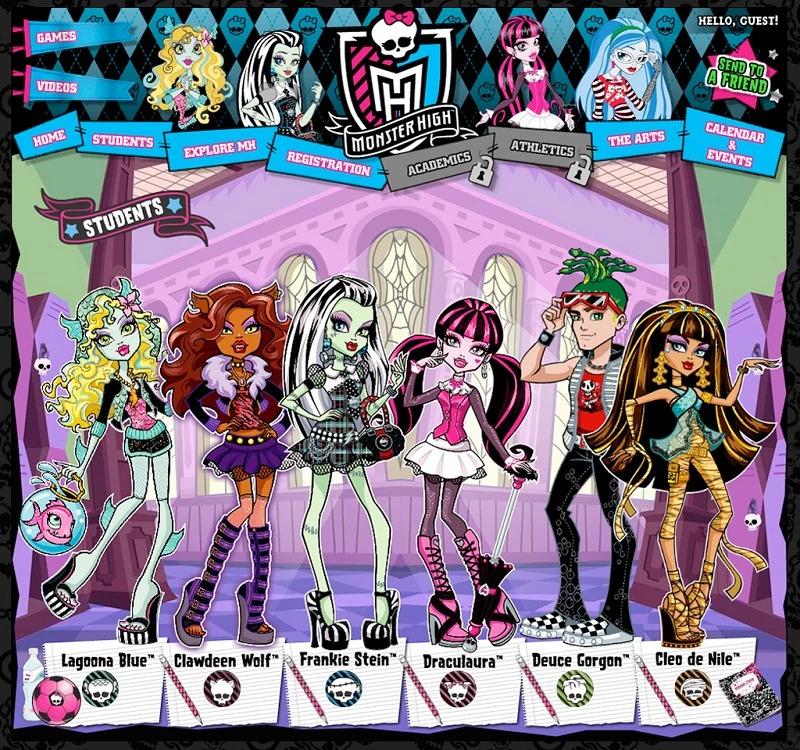
If you want a look back at what the website the introduced me to the franchise looked like, the closest you're going to get is the screenshot at the top of this page. On the wiki it's labeled as being from May, 2010. That's not entirely accurate, because, as you'll soon see, most of the tabs woudn't be open for a while. The animations of the characters at the top also originally wasn't there, instead replaced by the box art of the characters. The only tabs that were available were "Home," "Student," and "Explore MH."
Now, I remember the homepage originally being the student page, but that could have been something I simply remembered wrong. Or it could have had something to do with the specific link I clicked. Or maybe it was even that I was so new to the website that the front page hadn't even been properly set up. We'll never know because of that archiving error.
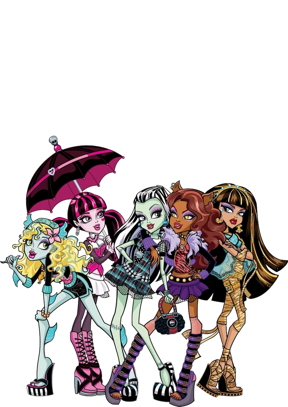
No matter what, though, this right here - the set up of showing the main characters (minus Ghoulia) with their gorgeously crisp artwork - is my first memory of Monster High.
And what a first impression to make! I'm still so in love with the original artwork for the original ghouls. I used to stare at it for extended periods of time and I thought to myself "yeah, in retrospect that was pretty weird" and then I looked at it again and immediately understood. The combination of Garret Sander's creative and clever designs, Glen Hanson's influence in the sharp art style and over all look of the characters, and Kellee Riley's beautifully detailed and stylish artwork created something absolutely magical. And that beautiful art work is the exact reason I wanted to have every piece of merchandise I could get my little hands on and hoarded the boxes. I wanted PRINTS.
Honestly, I still cringe at the idea that anyone ever threw their boxes away.
The aesthetic of the site also immediately had me hooked. Jesus, whoever was in charge of the branding for Monster High deserved a bajillion dollar raise. Maybe it was just because I'm me, but it practically called to me. The mixture of preppy patterns (plaids, argyle, and stripes) with macabre motifs (skulls, bats, stitches, chains, etc.) and bright colors (particularly the combination of bright pinks and blues, which was my favorite color scheme at the time), and how they contrasted against the dark grey and black backgrounds created a perfect recipe to pull me in. It was cute but rebellious. Morbid, but fun. Trendy, but alternative. Oh my god it was perfect in every way, shape, and form.
And if you would have asked me that summer, "Starlight, if you could pick one fictional school to go to, where would it be?" Hogwarts would not have even crossed my mind. I wanted to go to Monster High.
HOMEPAGE
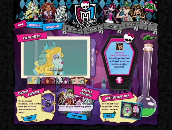
image from The Orange County Register
Originally from MonsterHigh.com
As I said, I don't actually remember this page initially being here.
While it largely resembles the version that would come in the Big Update, there are a few noticeable differences. Since the site was much smaller at launch, ironically, the pages that were originally advertised were much less surface level. While the homepage would later advertise the webisodes, character bios, and Monster Freakout, in the earlier phases it had links to download a student handbook and a map of the school (both of which we will look at later) in place of advertising the webisodes and character pages. The webisodes were also featured on the homepage under a label reading "FREAK SHOWS," but they were the largest element of the page and did not have their own unique page. This would later be replaced with a link to create your own student ID. An early iCoffin was on the page, though your only option was to read messages on it. Also, instead of texts, the messages read like Tweets with characters' contacts being listed as MH_(character name) and the characters sending messages to each other with @s.
Interestingly, the school spirit meter was on the site at this point, but I don't remember what it would reward you with since there were no games with codes at that time.
STUDENTS
Originally, the site was fairly small. Aside from the homepage, all that it had was the character pages and a page telling you to come back later for more. Well, that's not entirely accurate, since clicking on each character would lead you to their bio. So let's talk about the characters, as we are introduced to them on said pages! While I'll save my analysis of their outfits and designs for when I talk about the dolls, let's sink our teeth into these bios!
These things are iconic. The design here is really nice. Each character's profile remained unique while also sticking to the same format.
They all follow the same basic pattern, appearing on a background that looks like sheets of notebook paper covered in various watermarks unique to each character, plus one or two symbols resembling stickers. And let's not forget the skullettes that appeared next to each character's name. In total, that gave each character three emblems for their merchandise to be decked out in.
Characters would also all have their own unique background patterns.
Now, I don't think a lot of people know this, but originally the characters' pages all looked quite different! Between the site's launch and July (when the BIG site update happened), the bios featured different patterns from the finalized version and sometimes even different color schemes and emblems. Originally for almost half of the characters, in place of unique patterns were just diagonal stripes in black and whatever that character's signature color was (except in the case of Ghoulia, whose page was blue instead of red). I think it would be best to save any analysis for each individual character, though.
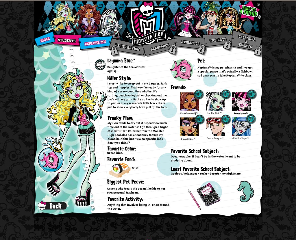
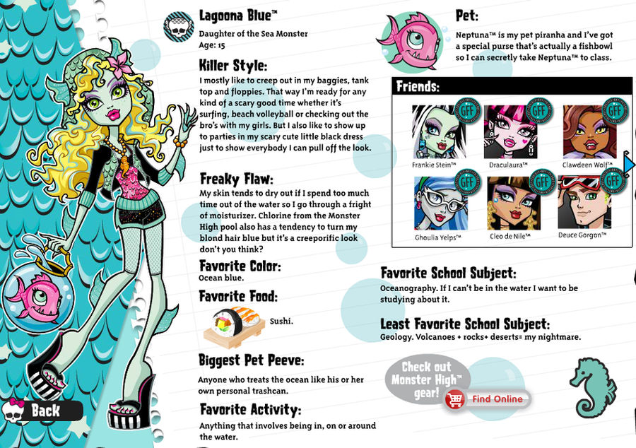
LAGOONA BLUE
 credit: Monster High on Flickr |
 credit: archived by SweetieShelly on DeviantArt |
It's odd to start out with Lagoona. You and I both know it. But because Lagoona is the furthest to the left and I don't know what pattern I'd go in if I was starting with Frankie (who's featured front and center), she's the most logical choice.
Lagoona's pattern remained the same in spirit between the updates, but was different in form. I actually prefer her original pattern to the updated one. It's a simple scalloped pattern of two hues of turquoise, with the lighter shade defining the edges. It would be updated to be much more detailed scales, matching those on her clothing, but I think that this design prettier, flat out. I have to wonder, with its black line work and white highlights, if the reason that Lagoona's pattern was changed has anything to do with printing. Lagoona's original pattern looks pretty flat by comparison and probably wasn't so striking on her box. Still, her original pattern was used on her wallpaper.
Also, the stars on her profile are a slightly different color. I don't have much of an opinion on the colors, but I will say that the stars look much worse with the new pattern because the thick lines start to make things cluttered when you add more elements and the other characters' profiles look less busy. But I understand why they changed it!
Her motifs are bubbles and seahorses. I think it's a cute detail that her necklace consists of circular beads (like bubbles) and a seahorse.
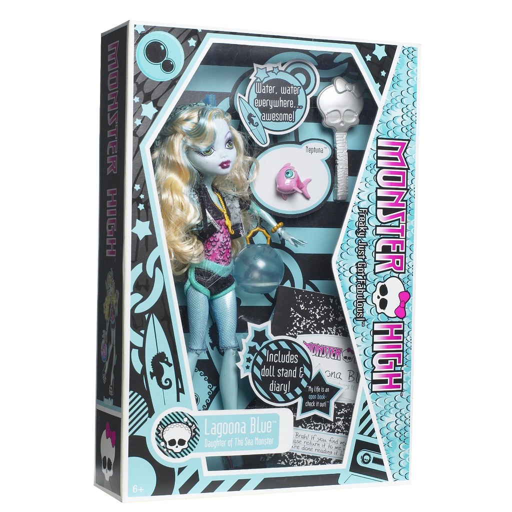
Early stock photos of the dolls show that all of the characters had boxes produced that featured at least one alternate emblem and an alternate skullette. Where exactly in the timeline that these fall is impossible to figure out. On one hand, if the boxes are older, then it makes no sense for the patterns on the profiles to have originally been so different (or in some cases very obvious placeholders) if they'd already decided what the characters' patterns should be. As we'll see later, Frankie's bio's entire color palette shifted based on her pattern changing. On the other hand, if the boxes were created some time between the original site and the update, it's just as weird since the skullettes are typically simpler and just don't look as refined. Still, I think they're worth taking a look at. And in Lagoona's original box, she was going to have a surfboard with a seahorse as her emblem along with her bubbles. It's not hardly worth mentioning that her bubble emblem was going to be black-on-color instead of color-on-black, as this was true of all of the dolls.
Lagoona's profile says that she's the daughter of the sea monster. While adults know that she's inspired by The Creature from the Black Lagoon's Gil-Man, I don't think a lot of kids would know this. I sure didn't. And I can't fault people at Mattel if they thought that kids would get it! Classic horror films used to air on TV a lot more frequently thanks to blocks like Shock Theater back when a lot of them would have been kids, so of course they'd be more likely to think of Gil-Man when listing horror monsters. But to a kid, Lagoona just seems kind of randomly tacked on. I don't think it's a coincidence that Black Lagoon was the least successful film out of the movies that inspired the ghouls and that Lagoona was the least successful doll.
I think it's cool how all of Lagoona's friends have the "BFF" marker because of how Lagoona, with her go with the flow personality, doesn't have drama with anyone. Also, making the fish girl easy-going for that "go with the flow" pun is something I can respect. Lagoona's description of her sense of style plays into this, as she describes wearing that style of clothes because of the versatility.
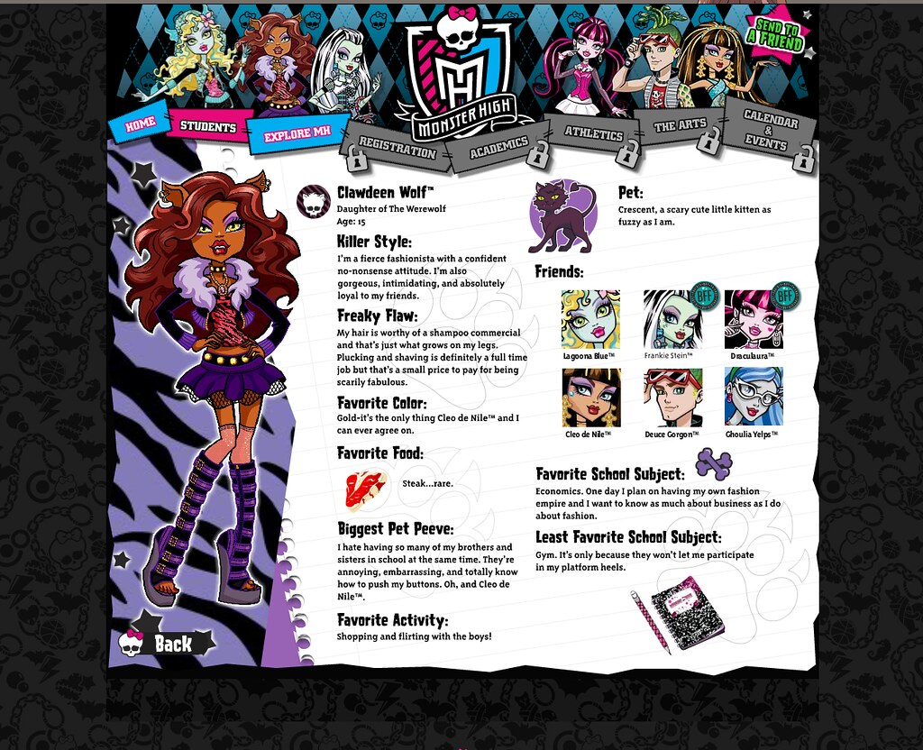
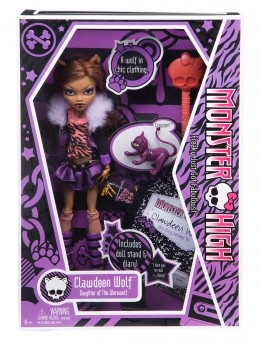
CLAWDEEN WOLF
 credit: Monster High on Flickr |
 credit: archived by SweetieShelly on DeviantArt |
Clawdeen's pattern changed the least in the update. It remains black on purple tiger stripes, but they ARE subtly different. The stripes were initially thicker and facing the opposite direction (so, like, going down instead of up). The color is also noticeably lighter.
The stars on her profile were changed from black with a glowing white aura to a flat purple that matches the trim on the bottom and sleeves of her jacket. While I don't really have a problem with the glowing stars (although it's strange that she has such unique stars), I think that the purple stars tidy up the design, which helps keep focus on the art of Clawdeen against the background.
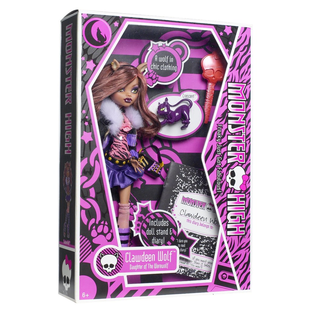
Clawdeen's symbols are clawed paw prints and crossbones. In the original version of her profile, the paw prints have thin lines and negative space between the various parts of the paw. You can hardly see them as they're much less bold than most of the other characters' symbols. In the update, these lines would be made thicker and the negative space would be filled so all parts were connected by the outline, without leaving negative space between. In the early stock photos, her crossbones emblem was replaced with a crescent moon with a wolf sitting on it and howling. Also the purple leaned much more on the magenta side. I'd tell you to put a pin in that, but the payoff is a looooong ways away.
I think it's funny how Clawdeen's Killer Style section tells you nothing about her fashion sense (besides that it's fashionable) and instead just describes her personality.
And then there's her freaky flaw. Instead of fully getting into it, I will just summarize. Clawdeen's freaky flaw is that her hair grows very fast, including her leg hair. Like most American teenage girls (at least in 2010 - I am no longer a teenager so I couldn't tell ya what kids these days are like), Clawdeen does not like having leg hair as she does not find it desirable to fit her aesthetic tastes. This was seen as a sexualized trait. And look. I don't want to fill this page with my ranting and raving over how stupid this is, but I think that if you can't possibly imagine a woman choosing to look a certain way because SHE enjoys looking that way and instead can only imagine that she'd make these choices purely because she wants to sexually entice men... y'know, maybe you're part of the sexualization problem. But I digress.
I think it's clever how Clawdeen's personality revolves around the concept of being "fierce." See, it's a pun because she's a werewolf! But rather than being fierce in the traditional, wild animal sort of way, Clawdeen's fierce in the modern sense: confident, strong, brave, and proud. It's a little more on the nose than Lagoona's "go with the flow" nature since Clawdeen's bio actually uses the word "fierce," but it's still something someone put thought into instead of just randomly choosing it to tick a box.
Clawdeen's profile is one of the few that remain intact via the Wayback Machine fro those looking for a nostalgia kick. Granted, it's not the VERY first one (you're going to have to settle for the screenshot I found if you want that), but it's still a fun little look into the past in higher quality than screenshots can provide.
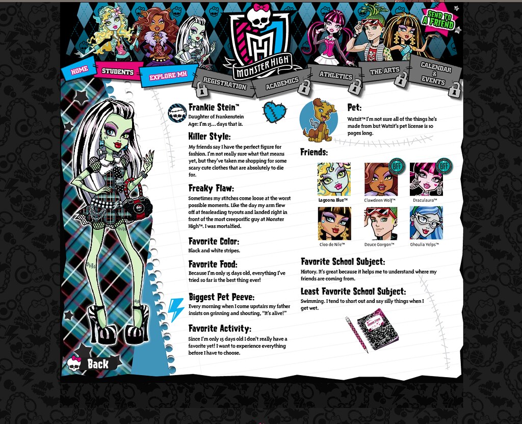
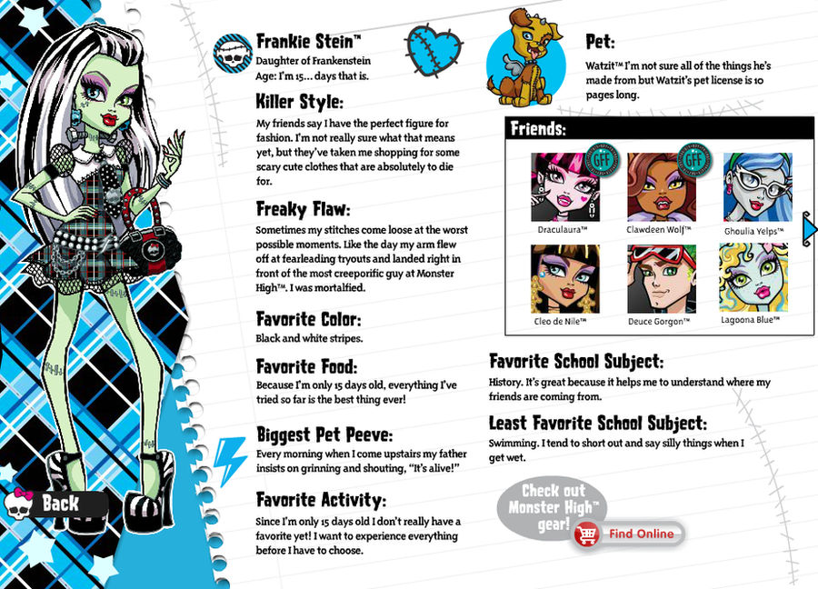
FRANKIE STEIN
 credit: Monster High on Flickr |
 credit: archived by SweetieShelly on DeviantArt |
My main ghoul since 2010! I already have an extensive analysis of her design planned out, but for now let's just look at what's on her bio.
Frankie's pattern was originally just the same as her dress. Her signature shade of sky blue was, in turn, also a much more muted cerulean. Including on her emblems and skullette. When you factor in how the characters' patterns would be used on their boxes, it seems almost inevitable that they would have to change the pattern to something using fewer ink colors and that would pop more on store shelves. And thus, Frankie's plaid would be adapted into a version using only blue, black, and white (with some shades in between). I think this makes her stand out against her background a little better, though. Don't you?
Frankie, like Clawdeen, also originally had black stars with a glowing white aura. This makes sense because anything else would clash or blend in with her original plaid pattern. After the update, these were able to be changed into a very pale cyan that isn't quite the same shade as any of the lines found in her new monochromatic plaid. While I do think all of these decisions were for the best, I am filled with a lot of nostalgia seeing these all-but-forgotten original designs.
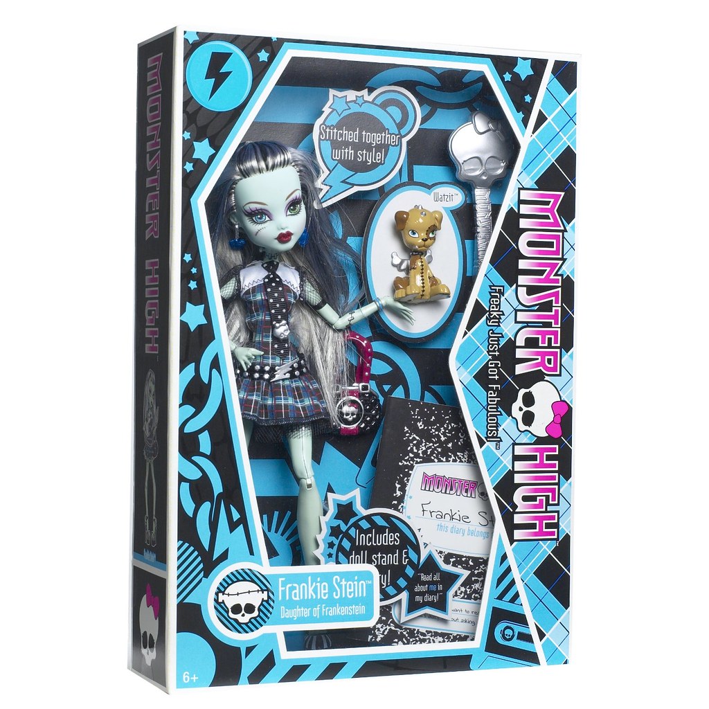
Frankie's emblems are a heart with stitches and a lightning bolt. Her profile uniquely features a third motif in the form of stitch watermarks on her page. All other characters had one emblem acting as a sticker and the other as a watermark. Perhaps the problem was that Frankie's aren't quite simple enough for that? Or maybe it's just because she's the main character.
Funnily enough, in her prototype box, Frankie only has her lightning bolt emblem. While the stitched heart is featured just above her skullette in the finalized box, here there's just another lightning bolt (albeit upside down). I wonder if this has anything to do with why Frankie is the only character to have her symbol in the top corner be the same as her symbol on her little quote insert?
Frankie's entire personality is based on newness. Not only is she new at school (thus making her a perfect audience surrogate), but she's new to LIFE. I'm going to go over this more when we talk about Frankie's first doll and diary, but this also sort of makes her a good audience surrogate for a young audience. Because, while a young audience isn't quite as naive as Frankie (who doesn't even know what her favorite food is), they are still trying to navigate a world full of changes and trying to figure out who they are.
Oh, and also it's sweet that Frankie's favorite class is history because she wants to know more about where her friends are from. I also wish they would have actually played into Frankie's distaste for swimming and saying silly things later on in the series during the many, many episodes and specials where the characters were near water.
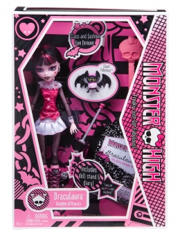
DRACULAURA
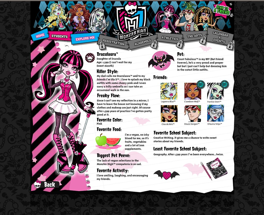 credit: Monster High on Flickr |
 credit: archived by SweetieShelly on DeviantArt |
Draculaura is the first of three characters who reuse the same pattern of stripes on their signature color. Of the remaining monsters, only Cleo would be an exception to this rule. This pattern would later be replaced with a criss-crossing black pattern over pink that looks similar to fishnets, likely as a nod to the amount of mesh that Draculaura has to wear to block out the sun. On the boxes and in her wallpaper, this pattern would be covering a gradient, but it's simplified to a plain, flat pink here.
Draculaura's stars stay almost the same, but follow the same trend as the others by being slightly lightened here. I assume this was probably mostly to follow that pattern or because the pink in her new background is a bit lighter.
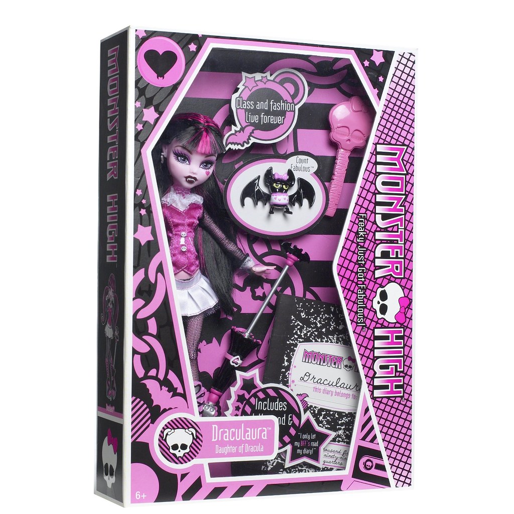
Draculaura seems to accidentally have three emblems. Only two are shown on her page: bat silhouettes and a batwinged, polka-dotted heart (the polka-dots are probably an artifact from her old design, but we'll get there in the doll section ;) ). However, likely because these two shapes are very similar, the winged heart would be replaces with a fanged heart on her box.
This can even be seen on her prototype box. There, though, the heart's silhouette is very different with the fangs sticking down instead of being on the heart. If you'll also notice, the bats originally had little bows on them, making them look similar to Count Fabulous (although the bows' placement was different). While I MUCH prefer the heart used on her final box, I do kind of wish the bats would have been able to keep their little bows! I don't see any reason to take them away when it wasn't very intrusive to the design. Oh well.
Unlike the other ghouls we've covered so far whose personality's all were a direct derivation from the type of monster they were, Draculaura's personality is a subversion of typical vampire portrayals. As I'm going to repeat ad nauseam in this deep dive, the year was 2010 and Twilight Mania was in full swing. More than ever, vampires were associated with brooding angst and emos. And then there was Draculaura whose favorite activities are "smiling, laughing, and encouraging [her] friends." Who was donning pink frills and always smiling. Who was taking the most culturally relevant idea of a vampire's personality and flipping it on its head. The fact that she's a vegetarian/vegan vampire is also part of this. Not only is it a subversion of vampires, but it's giving Twilight a playful jab. For those who either don't know or need their memory refreshed, the main vampires in the series refer to themselves as "vegetarian vampires" because they refuse to drink human blood and instead just hunt animals. So Draculaura takes this a step further by being a literal vegetarian vampire. Although, whether she's vegetarian or vegan seems to be up in the air. Her website bio has always referred to her as vegan, but her box called her vegetarian. The wiki says she's been depicted eating ice cream in some media, but there is such a thing as vegan ice cream and sorbet. Either way, I still hold that it's likely a play on Twilight.
Also you gotta love that Mattel had to do something with that Ula D trademark by slapping her nickname (which would never be used ever) in her Killer Style section. An interesting relic, nonetheless.
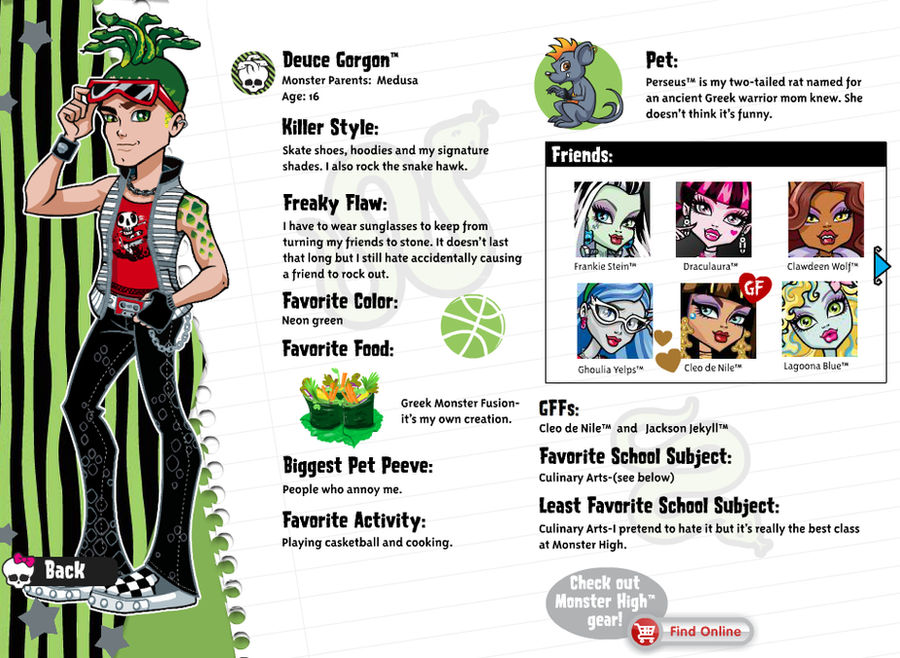
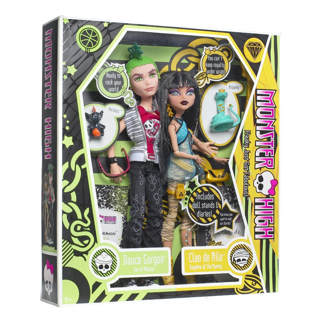
DEUCE GORGON
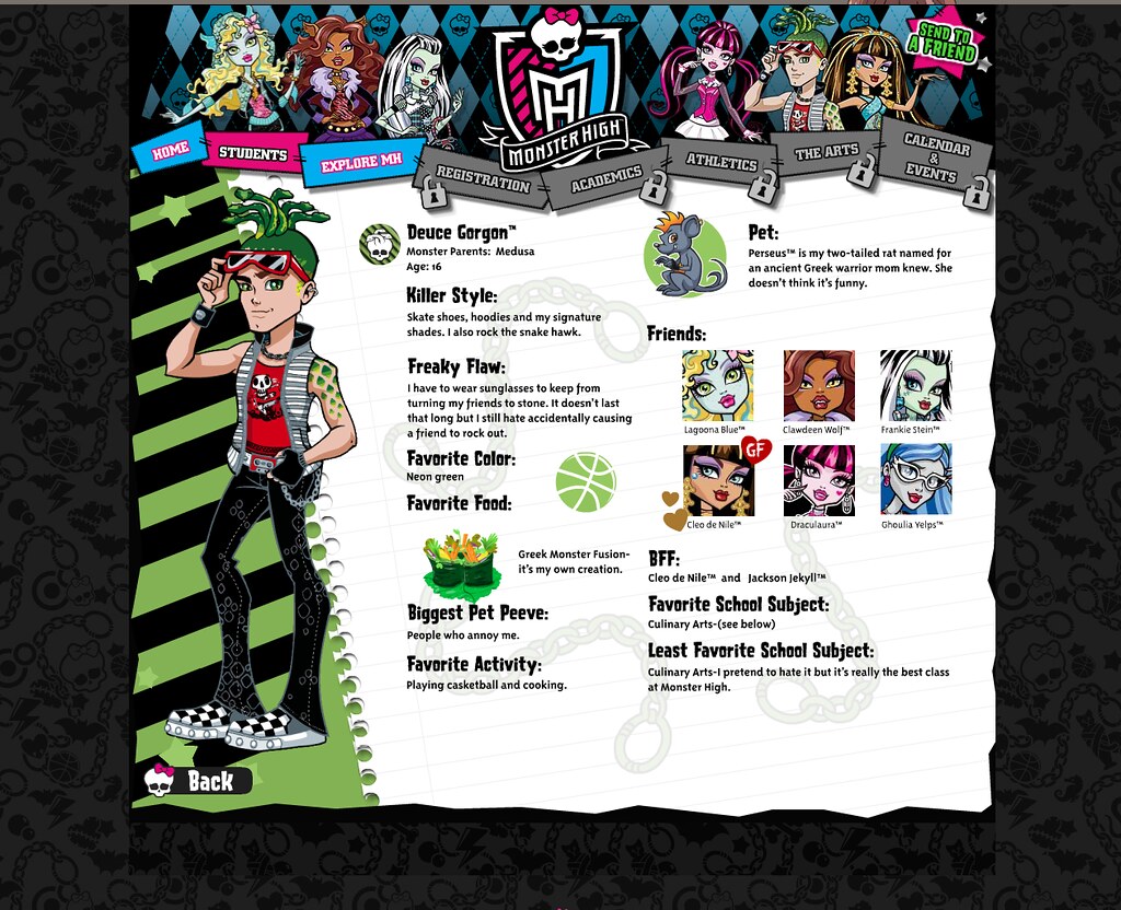 credit: Monster High on Flickr |
 credit: archived by SweetieShelly on DeviantArt |
Deuce is striped profile 2 of 3. Poor guy isn't even afforded two shades of green on his original the way Draculaura had two different shades of pink. Or the correct layering of his patter over the notebook pages. Deuce fans were NOT winning in May 2010. Luckily, these would be amended in July when he'd get his new pattern of... stripes... but this time vertical... Okay, so that's not entirely fair. These new stripes were sort of squiggly and give the impression of snakes, sort of. It kind of matches the stripes on his vest which might look just like stripes at first glance, but upon closer inspection aren't perfect or even, either. Those aren't quite so dramatic, but they're also shorter lines.
Deuce bucks the trend of each character's stars becoming lighter with the update, swapping light green stars for medium gray. I think they'd look a little better if they were a little lighter, but I think they're supposed to be the same color as his accessories and the pattern on his pants, so I understand why they'd make them that color even if I don't agree with it (I'd have gone for the lighter shade on his belt buckle). The color is also the same as his pet rat's fur, though, so that's cute.
I think Deuce is the first character to get one of his emblems completely overhauled. While his basketball (casketball) emblem has always been consistent, his original profile has the notebook pages sporting a watermark that looks like handcuffs. The chains make S shapes that resemble snakes, but otherwise it doesn't really play into Deuce's personality or the type of monster he is. Like, what, are you telling me he's going to get arrested? These would be replaced by snakes in the update. Interestingly, on his prototype box, these snakes would look a little different. Their heads aren't as pronounced as they are in his updated profile art, which would be used on the finalized box.
Did anyone else spend years wondering just what's in Greek Monster Fusion or is that just me? I'm thinking that it's probably some sort of grape leave dolma. It looks like sushi, but dolma is eaten in Greece (even though it originated in the Ottoman Empire), so I think that makes more sense. Now the question is just what's in it? It looks like there's lemon, parsley, onion, and carrot in there, it's hard to discern, especially when I'm relying on lower resolution screenshots of the profile instead of being able to see the original file on the site. CURSE YOU MATTEL. The closest I think you can get is making Greek dolmas with shredded carrots and Mexican green rice thrown in (it is a fusion dish after all). I have no idea how it'll turn out, but that's my best guess as to what Greek Monster Fusion is.
If you look at Cleo's picture, it has a couple of gold hearts next to it. While this trend wouldn't go on forever, it's cool that the hearts use her favorite color. In her profile, Deuce would have green hearts in turn.
Like Lagoona, Deuce's monster heritage always stuck out to me. The difference is that, while I now know about Creature from the Black Lagoon, I'm now even more confused by Deuce. Everyone else from Wave 1 has a monster parent from a movie and then he's just... Greek mythology??? My current theory is that Deuce's creation centered around Cleo. Cleo is named after Cleopatra, who famously died via asp bite (hence Cleo's snake Hissette), so giving undead Cleo a boyfriend covered in snakes is poetic. There was a 1964 film by Hammer Films (a studio who would remake many of the classic Universal monster movies) called The Gorgon, so I guess Deuce could have taken inspiration from that? But I still hold that he was likely made with Cleo in mind.
Oh, and I wish that we would have gotten more of an arc about Deuce becoming more open about liking cooking like that one kid in High School Musical got.
One last thing! I do NOT remember Jackson's name being dropped so soon, but as you can see, right in Deuce's May 2010 profile, his name was out in the open. I guess I just never bothered reading that part since there were the "friends" buttons right there.
CLEO DE NILE
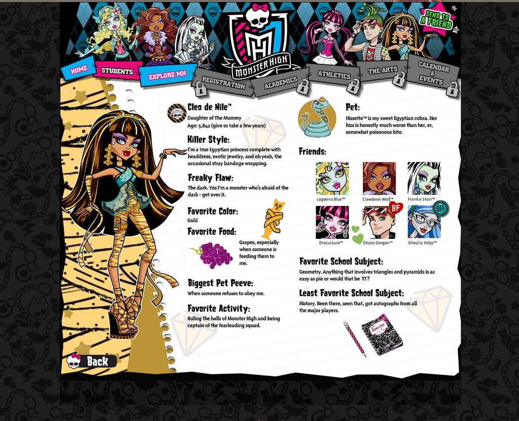 credit: Monster High on Flickr |
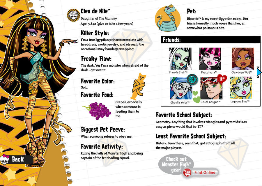 credit: archived by SweetieShelly on DeviantArt |
The queen herself. Er, princess. Cleo's profile was actually the very first one that I clicked on when I first found the Monster High website. It was entirely because of her striking golden highlights bringing me in.
Cleo's profile, much like Lagoona's had two patterns with the same subject matter taken in two different approaches. As opposed to Lagoona's, though, her original pattern echoes her clothing a lot more, looking quite similar to the pattern on her jumpsuit. But, like a lot of the changes, I think one of the big reasons it had to go was for packaging purposes. Since Cleo was in a two pack with Deuce, her pattern had to be sort of combined with his and this wasn't going to cut it. Not to mention how it's in a completely different style from the other patterns. So it was replaced with another bandaged pattern that's a lot brighter in color and gives Cleo a signature golden yellow color for packaging. Just like Frankie, this would mean recoloring some of the older elements that were originally a duller gold. Let me address the elephant in the room right now: yes, her new pattern looks like shredded cheese. I don't actually know that anyone else has ever thought that, but I always have, so...
Naturally, the stars also changed color. Their original true golden color would not have gone very well with this new pattern's color, so the change is welcome. While I do like Cleo's original signature gold and think it would have been very cool if she could have had, like, a metallic gold box (if not for potentially horribly clashing with Deuce's colors), she would have stuck out like a sore thumb. I know Cleo likes standing out, but sticking out's quite different.
Cleo's emblems are a gemstone (presumably a diamond) and a cat mummy. Initially, I thought that the cat was a Canopic jar (the jars they put mummy organs into) and was going to dig into the symbolism behind which jar it was and all that. But no. As it turns out, there is no cat headed Canopic jar and instead what it depicts is a cat mummy.
credit: WayBack Machine archive of ShopJustice.com
Both of Cleo's symbols on her prototype box were quite different from her finalized version. The diamond was originally much more detailed, whereas it's more stylized in the final version and on her profiles. The cat mummy is nowhere to be seen, with her second symbol being the Eye of Horus. If you look closely at the eye, it has two light-catches in the form of a heart and a star. I have to wonder if it was changed for being a religious symbol or something. Probably not, but I can't think of any other reason to change it so drastically Either way, I like her little cat mummy symbol and think it ties more into Cleo's personality than a general protective symbol.
Much like how Clawdeen's Killer Style section feels like it's a relic of some earlier draft, I've always found the phrasing of Cleo's Freaky Flaw kind of weird. I have to wonder if it was originally part of a fear section or something. Like, sure Cleo elaborates that her flaw is being afraid of the dark, but at first she just lists it as being "the dark." I dunno, I just have always thought that was odd.
I love that even though Cleo might be a spoiled princess, she's no dummy. Her favorite subject being a form of math, a lot of people's LEAST favorite, gives her just a little bit of depth at a time when she was still kind of just the mean girl.
I don't think I need to spell out that Cleo's personality is based around her being royalty. She's the popular rich girl because, while Egyptian mummies weren't always royalty or even rich, the ones in pop culture and especially film typically are. Hence, Cleo is literally royalty which translates into being the queen bee. I think a lot of Monster High fans forget exactly how much character development that Cleo would go through, but she wasn't always as complex as she'd end up becoming! There's a reason Clawdeen had beef with her in the beginning. Still, though, Cleo's mean streak was necessary to create conflict in the early days of Monster High before we had very many characters.
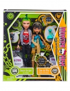
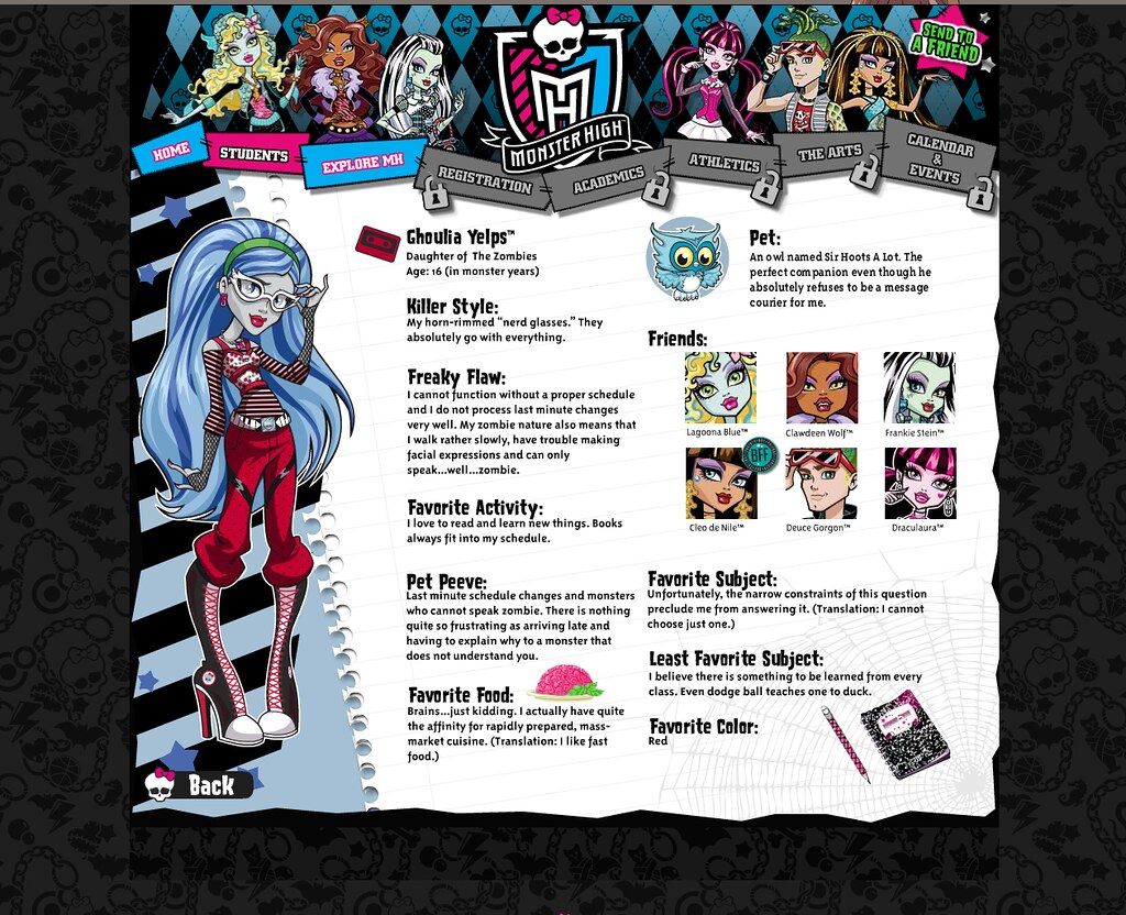
GHOULIA YELPS
 credit: Monster High on Flickr |
 credit: archived by SweetieShelly on DeviantArt |
Ghoulia's profile wasn't plastered on the front page like the other characters'. And yet that just made her catch my attention all the more because I saw her as a secret character, hidden away for real fans to discover. Kind of silly, but I was 11!
Ghoulia's profile's look radically changed between May and July. Originally, she didn't even have her signature colors on the profile. She's the last of our three characters to have this striped pattern. Later on, she'd get a unique horizontally striped pattern that would match her shirt. But, like Deuce, she originally didn't even have two different shades of gray in her bio page.
With her new color scheme, her stars would go from blue to grey. I don't think they're exactly lighter, but they do reflect that they found a color scheme for Ghoulia that wasn't just the color of her hair. Just like with Frankie and Cleo, this is also reflected in elements of her bio being recolored.
?file=Website_-_May_2010_students_page.jpg#The_Arts)
You can really tell that they were still figuring Ghoulia out from her emblems in the original page not even being close to her finalized ones. Even in her update, only one of them is there. In the original page, Ghoulia has a cassette tape sticker (which would be used on all the boxes even if it was related to her bag's shape) and some spider webs in the corner of her page. I can see how these would kind of symbolize her, even if the cobweb is kind of generic. A cassette tape is retro, as in behind the times. That reflects how Ghoulia moves veeeeeerrrrrry slooooooowwwllllllllly... Cobwebs similarly show inactivity, like in an abandoned house. But they're both generic, as the cassette tapes are featured on everyone's packaging and webs are also featured on all the diaries. In the update, the spider webs would be replaced by stylized owls, reflecting Ghoulia's pet as well as her intelligence. However, it wouldn't be until Ghoulia's dolls went into production that she finally got her second unique symbol, a lightbulb with a brain inside.
Y'know, I've seen a lot of people recently say that Ghoulia is coded autistic and I never really understood that until looking over her profile again. I honestly thought it was just because she was smart and nerdy that people thought that. But she also takes comfort in schedules/routines, has trouble expressing her feelings, and is basically nonverbal. So, y'know what? I think that's a headcanon I can get behind.
Also, I love that Ghoulia's favorite color is red, a color associated with speed.
As a kid, I thought that Ghoulia's name wasn't as good as the others (aside from Lagoona's since I didn't know about her movie, but I've already been over that). "Ghoul" is a fairly generic term, after all, so I thought it was a name that could fit any monster. But I was so wrong! The most influential zombie film of all time is Night of the Living Dead, but the film never actually uses the word "zombie." The monsters are instead called "ghouls." So, actually, the name is just as clever as the others if you know a bit about horror history!
Ghoulia, much like Draculaura, is a fairly subversive character. Zombies are typically portrayed as being mindless, so making Ghoulia the smartest ghoul in school subverts that portrayal. Additionally, zombies are usually after brains (something Ghoulia jokes about in her favorite food section), so giving her an association with brains by making her particularly cerebral is also clever.
And that's it. That was the full extent of the website back in May 2010. All the other tabs were greyed out and locked. But in July, that would all change...
THE BIG UPDATE
I don't know if all of the Big Update hit at once. I know that there also were some small updates here and there because, for example, there was some content released in between that was likely on the homepage (the webisodes, the game Monster Freakout, etc.). But at the very least, it all happened very, very fast. Most of the locks came off and the site finally came into fruition around July 12th, 2010.
It's time to get immersed, baby!
The updated site was all about pretending that you were going to Monster High. A lot of the newly added games would focus on this angle. We'll actually dive into those soon, but for now I just want to mention how the "registration" quiz here would give you a schedule that would be uploaded to your profile. You could change your schedule, too, if you wanted a different one. Not that anyone else would see it or anything, but it was about playing pretend.
HOMEPAGE
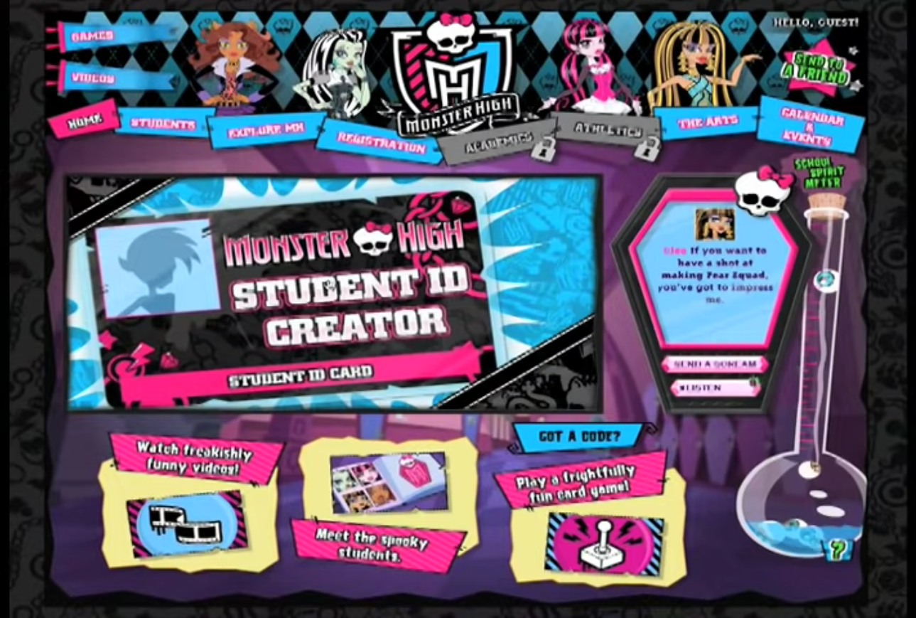
screenshot from Higher Deaducation short
On the homepage, you were now able to "message" the main characters on an iCoffin. I can't really find what would happen, though I assume they'd each have a couple of generic messages to send back thanking you for your kind words. I know that the iCoffin would cycle through various messages by the characters that would usually (but not always) be directed towards the user, but I don't really have an archive of all of them or anything. There also seemed to be an option to listen to some of these messages, but, again, it's not terrifically documented.
As stated earlier, the School Spirit Meter would now award you with codes that you could input into the games to unlock things if you didn't have codes from buying the dolls or that stupid LED iCoffin the site tried to shove down your throat. If you don't know what codes I'm talking about, buckle in for the games page.
EXPLORE MONSTER HIGH
After the update, the "Explore Monster High" tab, once host to a list of things you could do once the website fully launched, now hosted fun facts about the school. While there sadly is no documentation of it that I could find, the wiki's summary jogged my memory enough that I'm pretty sure its information is accurate. According to the wiki, the section featured screenshots from the show and a list of 10 Fast Facts about the school, which they graciously saved. Check 'em out!
- Monster High has special evening classes for monsters who only come out at night.
- MH has exchange monsters from 40 different countries and 5 dimensions.
- Make sure you study for your S.A.T. (Scary Aptitude Test).
- Watch out for piranhas in the school swimming pool.
- Headmistress Bloodgood has her own parking stable for her (night)mare.
- Making coffins in shop class are not only a requirement for vampire students, but extremely practical.
- If you are blood-intolerant or have garlic allergies, please get a witch doctor's note for the creepateria.
- Avoid the horrors of homework: write in your decomposition books every day and keep the moaning to a minimum.
- Village Mob fire drills are done regularly. Please be prepared.
- Being turned to stone by Deuce Gorgon is not a legitimate excuse for missing class.
Before August 29th, 2012 (thank you random children online for accidentally documenting the website), this section would be replaced by the Student Lounge in the links at the top of the site. It would seemingly still be operational if you had the URL, however, until either late May or early June of 2013, only months before the next major site update.
REGISTRATION
The next link on the menu was Registration. Registration concerned all of the immersive activities, like that quiz I mentioned earlier and creating your student ID and decorating your locker. If I remember correctly, your ID, schedule, and locker could all be saved if you had an account. The wiki also says that this is where you could now find the map of the campus.
You can see the campus's coffin shape in the map. My favorite detail about it has to be how Clawdeen's background pattern gets repurposed here as grass and how Lagoona's pattern is used for the pool. It's a neat little Easter egg. Also, I have to wonder if this map is accurate to the layout of the school in other media. Specifically, the video games. I'll have to remember to compare it when I get around to playing them...
If I'm not mistaken, this was also the new home of the printable handbook. The handbook featured tips to survive the school year, as well as a class schedule and a list of important dates. These dates would seemingly be canonized, at least in the diaries, as it mentions classes starting on September 7th. Although the year the events of the series take place during would be retconned multiple times, it was definitely originally intended to be 2010 because the date for the Scream Queen dance listed fell on a Friday, while the date for the SATs fell on a Saturday, which is when they're usually held. Is that important? Not really, but I just felt like pointing that out because of some misleading information on the wiki.
ACADEMICS & ATHLETICS
Academics and Athletics were both closed off for a while longer than the rest of the site. Even in Higher Deaducation's footage of the site, it shows the two tabs grayed out with locks on them. I don't have concrete information on when they opened up, but I seem to remember that it was by the end of the year.
Academics hosted information about the teachers and staff of Monster High. It also featured activity sheets ("homework") that you could print out. To my knowledge, these have all been saved. The wiki lists there being four, which is how many I found. Mrs. Kindergrubber had a maze, Mr. Hackington had a recipe, Mr. Mummy (who I have never seen before in my life yet who had official art) had a tangram activity, and Mr. Where had a MadLibs style activity. The MadLibs story is based on the webisode “Clawditions."
Similarly, the Athletics section would also feature two printables. The first was a list of Official Monster High Cheers that you could learn and practice. The second was more akin to a homework assignment in the form of a week long fitness challenge. Nothing crazy here, but kids were challenged to do one athletic activity a day including running a mile, playing basketball, balancing on one foot, and making up a dance routine. At the end, you got a certificate. The athletics section also featured a leaderboard from a daily game, but the wiki says that this was fairly short lived as by late 2011, it stopped being updated. Darn. I'd love to check it out, but, like many of the other sections, it is lost.
THE ARTS
The Arts was the section that featured the most downloadable by far. This was where you could download the Fright Song, the lyrics to the song, and other various goodies including wallpapers of all the characters and apparently a ringtone? I don't remember the ringtone, but I do remember having my laptop's background be a slideshow of all of those wallpapers for a while.
CALENDAR & EVENTS
Finally, there was also a section labeled "Calendar and Events." I don't remember what was there, I have found no screenshots or videos of what was there, and the Wiki doesn't say what was there. It was unlocked for a long time, though. If I ever accidentally come across any information on it (because you would be amazed how much more of this information I came across by total accident), then I'll update this section.
CLOSING THOUGHTS
I think that the idea to put so much emphasis on imagining that you're going to Monster High also was a good idea since it makes you put yourself in Frankie's shoes. Empathizing with the main character is obviously going to make you more attached to them. Plus, the immersion made you invested in this universe. Suddenly it was YOUR imaginary school, too. I mean, you were practically given a blueprint for your daydreams. The website was part of the experience to me and one of the strongest points of the brand's launch.
In our next article, we'll be taking a look at one of the first sounds you'd hear when booting the site up. It's time to look at the Fright Song.
| BACK | INDEX | NEXT |